In a previous project, we undertook an extensive data collection effort focusing on contamination levels in Martorell, a town located in Catalonia. The dataset spanned a substantial timeframe, encompassing the years from 1991 to 2022. This provided us with a rich and comprehensive dataset that allowed for a comprehensive analysis of pollution trends and patterns over the entire duration. Leveraging this dataset, we generated multiple graphs that effectively portrayed the temporal variations of various pollutants. By visualizing the data, we were able to identify and illustrate the trends, fluctuations, and patterns exhibited by different pollutants over the years. These graphs provided valuable insights into the dynamics of pollution in Martorell and served as a foundation for further analysis and interpretation.
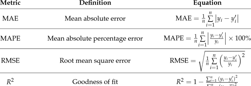
The primary aim of this project is to forecast pollution data for the year 2023 by employing various methodologies, including the Prophet and ARIMA models. Through the utilization of different forecasting techniques, the objective is to evaluate their effectiveness in accurately predicting pollution levels. Initially, the plan was to assess the accuracy of the predictions using the r^2 metric, which measures the correlation between predicted values and actual data.In this context, the correlation coefficient (r) has a range of values between -1 and 1. A value of 1 indicates a perfect prediction, which is extremely difficult to achieve. As the value of r approaches 0, the quality of the prediction decreases, indicating a less linear relationship between the variables under study. However, due to its lack of accuracy, alternative statistical measurements such as Mean Absolute Error (MAE), Root Mean Squared Error (RMSE), and Mean Absolute Percentage Error (MAPE) were adopted. These metrics offer valuable insights into the accuracy of the forecasting methods by quantifying the deviations between the predicted values and the actual data. By comparing and analyzing these statistical measurements, we can determine which forecasting method demonstrates the highest level of accuracy in predicting pollution levels for the specified time period. This evaluation is crucial in selecting the most reliable and effective methodology for future pollution forecasting endeavors. These are the formulas that we will use in these calculations:
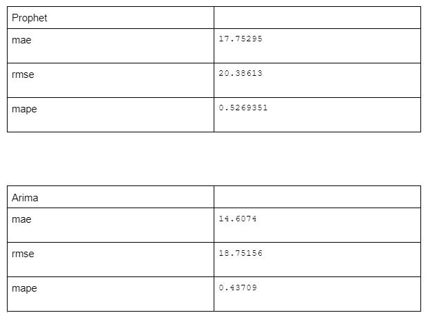
First, we imported the required packages, including "prophet" and "forecast," into our RStudio environment. These packages provide the necessary functions for fitting the models. Next, we loaded the actual data, stored in a CSV file, into RStudio using the "read.csv()" function. This imported the data into a dataframe, allowing us to work with it. Following the data import, we conducted an initial exploration of the data to understand its structure and characteristics. This involved checking the available columns, examining the sampling frequency, and addressing any missing values, among other tasks. Once we gained a basic understanding of the data, we proceeded to fit the Prophet model. Using the "prophet()" function from the Prophet package, we provided the time column and the column containing the values to be predicted as arguments. Additional optional parameters, such as the inclusion of seasonal effects or holidays, could be specified to refine the model. After fitting the Prophet model, we used the "predict()" function to generate future predictions. By specifying the desired number of future periods using the "periods" parameter, we obtained the forecasted values. Moving on, we fitted the autoarima model. Utilizing the "auto.arima()" function from the forecast package, we provided the column with the values to be predicted as an argument. This function automatically determined the optimal (p, d, q) orders for the ARIMA model through automated methods. Once the autoarima model was fitted, we employed the "forecast()" function to generate future predictions, specifying the desired number of future periods. Having obtained the predictions from both models, we compared their performance. Evaluation metrics such as root mean square error (RMSE) or mean absolute error (MAE) were used to assess how well each model fit the actual data. Additionally, we visualized the predictions and actual data using graphs, such as time series plots or scatter plots, to gain a visual understanding of the models' performance. Finally, we made an informed decision regarding the model that best suited our needs based on the evaluation metrics and visualizations. As evident in the provided table, the autoarima data demonstrated greater precision compared to the Prophet data, as they were closer to zero. Consequently, we can conclude that, in this particular project, the autoarima model outperformed the Prophet model.
In this part of the code what we do is make the prophet, basically we are making the prediction of the data.
.png)
With the metrics library, we calculated the 3 values we needed, mae and rmse and mape, inside the prophet to see the precision.
.png)
With this part we do the same as before but with the ARIMA. As it gives us more data we will select the ones we need (mae, mape & rsme).
.png)
In this data analysis project conducted in RStudio, we compared the current data with the updated NO2 data to evaluate the accuracy of predictions or data updates. We utilized two dataframes, namely "current_data" and "updated_data," which contained relevant columns such as date (date and dat) and NO2 values (no2) for our comparisons. To visually represent the evolution of the current data and updated NO2 data over time, we created a line graph. The current data was depicted by a blue line, while the updated data was represented by a red line. Through this graph, we could observe and compare the trends and patterns exhibited by the current data and updated NO2 data. We analyzed how NO2 values changed over time and assessed whether the updated data accurately captured the fluctuations and variations in the actual values. This type of comparison is valuable for evaluating the quality of predictions or data updates. If the updated data closely aligns with the current data, it indicates good predictability or updateability. Conversely, significant discrepancies between the updated data and the current data may necessitate adjustments or improvements in the prediction methods employed. In summary, by analyzing and visually representing the current data and updated NO2 data, we gained insights into how the predicted or updated values corresponded to the actual values. This information provides us with valuable knowledge about the accuracy and reliability of our forecasting or updating techniques.
.png)
Here is the poster with all the graphs ans resoults of the project